Monday, 22 February 2016
Evaluation Questions
Footage we are not using
We have decided we are not using the Smashing Bottles in our music video, as we feel like they haven't turned out the way we wanted them to look.
We used an IPhone 6 as advised by our teachers due to the fact buying new equipment would be too expensive, we thought the footage would come out clear, however exporting it onto a Mac we lost nearly all the quality, it became all blurry and the slow motion was ineffective. We were going to redo the smashing bottles video however, we thought it would be too time consuming and wouldn't change the quality as we didn't have different equipment to use anyway. We also tried filming it without the slow motion and creating this effect on final cut, however the footage was jolty.
We used an IPhone 6 as advised by our teachers due to the fact buying new equipment would be too expensive, we thought the footage would come out clear, however exporting it onto a Mac we lost nearly all the quality, it became all blurry and the slow motion was ineffective. We were going to redo the smashing bottles video however, we thought it would be too time consuming and wouldn't change the quality as we didn't have different equipment to use anyway. We also tried filming it without the slow motion and creating this effect on final cut, however the footage was jolty.
Our music video limitations
When creating our music video, we feel we came across many limitations in which we felt were out of our control to easily correct.
Due to all of these limitations hopefully you can understand better why some shots are not as clear as others or as could as they could be. For example the photo below, which with a wider availability of equipment and software and/or a wider choice of willing actors able to commit to more time and locations, we could have improved some footage and areas of our music videos.
Most of these limitations were due to the lack of effective equipment and the availability of software.
Examples of these were;
The camera quality: Due to being students we found the quality of our camera could have negatively impacted our music video and the effectiveness of our footage. We found that some shots were not as clear as we would have desired them to be. Another problem was sharing these cameras with other students which affected our time slot in which we could use these pieces of equipment.
One massive problem we encountered due to the lack of software was to do with our plans to film slow motion shots of smashing bottles. We have explained this on another blog post.
Actors- Although our actors were extremely cooperative and enthusiastic, due to being students themselves (one of them was also a full time boarder, who was not permitted to leave the school site) we found the time available to actually film was limited. Therefore, this left us with less choice in where and when we can film. This was the reason for the darker shots, which we had to edit and change the brightness of our footage. We have explained this in more detail here
http://sophiecomptona2mediastudies.blogspot.co.uk/2016/02/using-final-cut-pro_22.html
http://sophiecomptona2mediastudies.blogspot.co.uk/2016/02/using-final-cut-pro_22.html
Due to all of these limitations hopefully you can understand better why some shots are not as clear as others or as could as they could be. For example the photo below, which with a wider availability of equipment and software and/or a wider choice of willing actors able to commit to more time and locations, we could have improved some footage and areas of our music videos.

Using Final Cut Pro

 We are using final cut to create our music video, there are loads of possible ways to create a video on this program including different transformations and effects.
For all of our shots we are using a black and white effect, therefore we used matched colour throughout our project to make sure everything was exactly the same.
Due to some of our footage being very dark we had to brighten it using final cut. An example of this would be Tobi was walking up the hill. Doing this made our footage clearer due to a deeper contrast.


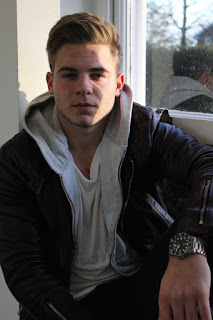
explanations of costumes
 We chose to do a post on explaining our actors costumes to show they wore the clothes for a reason and it wasn't just random.
 Emma- In parts of our music video Emma is wearing a green party dress, we wanted her to wear this as it is a very feminine and stereotypical teenage dress. We then decided for her not to wear her heels as it shows that she has been out for a long time and her feet were hurting. We made sure her face was heavily made up for a party to show she is hiding her emotions. We also wanted her to cry, therefore we got water and splashed it over her face in order to make her mascara smudge showing she has been crying. We also filmed her in normal clothes (a hoodie) when she gets home to show she has given up with the way she looks and this makes her more vulnerable.
Tobi- For all of Tobi's costumes we told him to wear what he wanted this was because we wanted a realistic image of a boy his age. His outfit choices were very simple to show a stereotypical teenage boy.
Grainy Photography explained!

When taking pictures for our digipak we felt like we did not want another photo of our artist on the back, therefore we took a several pictures in different landscapes. We found this photograph from Harrow Viewpoint was extremely effective, however can appreciate that it may come across grainy to some people. This again was due to the camera quality we were available too. However, also our location was to blame, as it was a viewpoint, at night no lighting was available. We decided to wait at the location till we found the natural light was appropriate however, this could be a cause to the slightly grainy appearance.
However, we rather like this natural effect and feel it slightly matches some of the grainy footage present in our music video due to the lighting and camera problems we experienced when filming. We also feel it matches our rusty and not clean cut artist.


Photoshoot 2
We needed to take more photos in order to complete our digipak as the photos we took on the first photo shoot were all very similar and the quality of the pictures when places in Indesign were not at a high standard.
Therefore, we took these pictures then used Photoshop to make them black and white which has been explained on my blog already.


Therefore, we took these pictures then used Photoshop to make them black and white which has been explained on my blog already.


Social Media Pages we created
 We created a twitter account first as it is a main source of social media most artists use to get in touch with existing and potential fans which was perfect for our artist. We thought as it is a key form of marketing for many artists nowadays that it would be good to see if we could create the same sort of effect. We have been "tweeting" regularly in order to create an interest with our target audience.
 We also created a instagram account to show pictures of our artists development, through-out our course work we will be uploading pictures such as the album cover, pictures from the photo shoot, music video locations to get fans excited for the release. We believe this is how real artists inform fans about up coming things in their lives.


Music Video Title
We have researched many music videos to see their titles for inspiration. When researching we hardly found any. We especially found none in our music genre. An example of one we found was Taylor Swift's, Bad Blood music video.


What we noticed is that it would not fit our genre of music as well as our actual music. For example, our music was very slow and emotional.
The titles of Swift's music video was very effective, as it made the sequence seem like a action movie in which fitted her storyline.
In using this concept in our video, it would take away focus and engagement in a emotion filled storyline and could distract and lose emotion, focus and sympathy from our viewers.
Therefore we made a bold decision to not include a title in the hope to sustain attention and allow the viewers to fully understand and empathise with our characters.


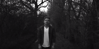
Shaky Beginning explained!
We started our music video with shaky footage of emma to create the effect that she is drunk, we believe this works well with the music.
We believe it may have one of the impacts on our viewers.
1. Allowed the viewers to understand how much Emma has drunk, and how unstable she is.
2. Empathise with Emma, as the camera work makes the viewer feel like they are unstable and drunk themselves.
3. Fitted with the odd, slow musical introduction to the song.
4. Feels like we are following her.
5. Shows her as vulnerable, as she walks alone.
6. May encourage confusement and engagement into what is to come.
7. Shows a long shot of Emma, therefore revealed Emma's costume and her hand holding a bottle of alcohol.

Thursday, 4 February 2016
Updated Poster
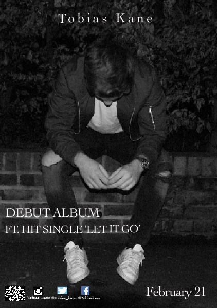
After constantly looking and critiquing our poster, we have decided to edit it and take out the text saying 'Self-Titled'. We feel like this was irrelevant, and gave the poster too much writing. We feel it is more effective and clear to leave it as just 'Debut Album'.
HOW MADE POSTER?
Monday, 1 February 2016

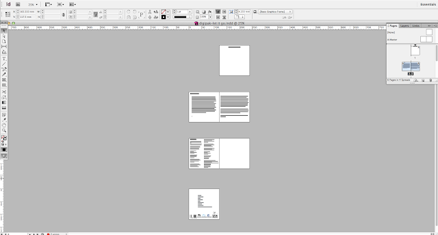
How we made our digipak


We used cmd to make the pictures smaller but keep the ratio then just moved the arrows to crop the whole picture including the white lines around the edges.
Once we knew what font we wanted all we did was copy and paste it to assure it was the same size the whole way through our digipak.
Using Final Cut pro
 We used Photoshop to edit our photoshoot pictures as they were really dark but also because we wanted them in black and white.
 We found it very quick to get the right thing we wanted, all we did was adjust the brightness by making it brighter as well as playing with the contrast.
  Lastly, we transformed our picture to black and white to match the theme throughout our video, digipak and poster.
  We also used photoshop to create a signature for our artist. We did this by starting with a black background, then we played around with the different pens according to thickness until we found the one that looked natural.
Subscribe to:
Comments (Atom)