Thursday, 28 January 2016
Second day filming limitations!
Finding locations to film was very difficult as the locations we planned in our story board weren't available so we had to find other alternatives. For Example, we didn't plan for our artist to lip-sing outside, however we had no other alternative but we thing this went it our favour as we feel like it is very effective and goes with the theme of our song.
As our actor didn't know the song lyrics we had to print them off and hold them up next to the camera in order for him to see them and also look into the camera. At first we though this wouldn't work, however it became very effective as we placed the words on the floor for the actor to see them it created a very emotional effect on his acting as he was always looking at the ground. Also the lip singing was very hard to achieve as it is very difficult to do it exactly the same speed as the song, we tired to film as far away from the actors mouth as possible so it wasn't as clear if his mouth wasn't exactly on time.
Lighting was a big problem with filming today as we filmed in the evening and there was little natural light. We over came this by filming near buildings where lights were on inside and also by filming near flood lights to give a more natural effect rather then using our own lighting which looks art
Digipack photoshoot
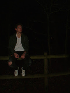
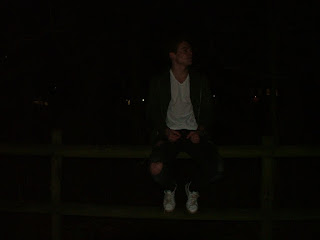
As our artist is male we have decided to use just him in our digipak instead of both our actors. As these pictures were taken in the evening they are very dark but using 'Photoshop' we are going to brighten them and then use a black and white effect on top.
We had an idea of the sort of pictures we wanted to take before we started the photoshoot, we thought by doing this we could same time as we were very limited at the beginning due to starting at around 4pm when it starts to get dark in January. Due to us wanting to use a black and white effect we weren't overly concerned about the darkness as this could be changed without effecting the colour within the photos.
These are are photographs
The is our favourite. In another post, we will explain how we edited these original photographs into black and white and brighter using Photoshop.
Our poster ideas
For our advert we would like to include the same characteristics (design) as our digipak meaning the same font, colour scheme (of black and white) and the same photo from the front of the digipak will be used as the main poster image. This will allow fans etc, to identify and recognize the artist in his different products.
Main ideas we want to include are:
- Artist name
- Album name (self-titled)
- Ft. hit single Let it Go
- Social media logos and web addresses
- release date of the album
Thursday, 21 January 2016
Poster inspiration
Research into Posters:
These adverts has the same picture, font and colour scheme as the digipak, this helps people recognise the digipak more easily in shops as they relate it to the poster.
These two adverts are from Pop artists. They have very similar characteristics such as the artists name is in bold writing and the only picture displayed is of the artist.
They also include the main songs within the album using the word "FEAT." to show this.
However both these posters don't show a release date which I feel is very important as it is a main form of advertising showing off when the album is getting released to get people excited.
This advert from Green Day an American punk rock band. It is very different from the other two as it is very simple due to artists wanting to focus more on the music rather then "the image".
They used a simple colour scheme of Black, White and Red to portray a certain image of violence and heart break. The font used is very clear and the exact same size and spacing as the digipak.
Tuesday, 19 January 2016
James bay redoing music video!
As we are following James Bay and his song 'Let it Go' we often research the song to keep updated with any news such as popularity of the song and artist, as well as comments and opinions on the song and video.
We found that because of the popularity of the song, Ed Sheeran joined James Bay on stage and sung 'Let it Go'. As the song is so popular, but the music video has been described as quite a "weak" video which does not portray the true message and emotions within the song and its lyrics, this video of them has been rumoured to take over the original music video of Bay singing in a bedroom.
If this does happen it may have an affect on our music video as people will associate the song more strongly to the music video in which they like of Bay and Ed Sheeran in comparison to the rather dull video of just Bay in which seems quite unmemorable. Although rumours, we haven't heard any definite changes to the music video. However, we felt we should note down this news, as it also shows how emotional fans find the lyrics and song describing it as 'a soundtrack to our dreams', 'beautiful rendition' and 'a soulful performance'. Therefore, we want to make sure this emotion is felt through our music video.
http://www.capitalfm.com/artists/ed-sheeran/news/james-bay-duet-let-it-go/#AizkPTIjAkXSMCX3.97
Friday, 15 January 2016
Thank you... (For Digipak)
I would just like to thank so many people for helping and inspiring me to write and record this album. This feels like such a long time coming. Thanks for the support, Charlotte Pain, Harry Ray, Richard Pardy, Mark Gastel and Hailey Evens. Also to my great record label Virgin Records, my brand manager Katie and to all the marketing team, cheers for everything and for all your commitment making this album so special! I would like to make a huge mention to my fans for your constant love and support throughout my music career, I love you all, I hope you love the album as much as I loved creating it for you! Give me a little tweet, I'd love to hear what you think.
We are going to insert a signature at the bottom of the page, this makes the things said that have been more personal and realistic.
About Artist for page in Digipak
Tobias Kane is a modern young artist born in Surrey in 1995, with a talent and love for music and songwriting. The true soul singer and guitarist went to the London School of Music, where his passion and skill for music grew. Through spending hours and hours a day in his room and singing on the streets, he became an inspiration to many for his enthusiasm and determination to share his work. 10 years on from the young teen, Tobias Kane now works in top studios, travelling around the world, sharing his work to his millions of dedicated fans.
He takes immense pride in his work, and loves the idea of creating and listening to music in which the whole world could be listening to, as he believes it creates a whole emotion in which himself and his fans can experience together.
His music is all about generating a new emotional experience for his fans.
Tuesday, 12 January 2016
Analysis of a digipak
We like this front cover due to the simplistic style and colour choice. The simple nature of the digipack cover creates a clear, uncomplicated, uncluttered front cover which simply showcases the artists name in large and the album name. The design around the name provides an engaging cover. We also found that this cover seems mature, sophisticated and based purely on music and skill within the album rather than the effects and editing for example, in a Lady Gaga album bright colours, editing and a busy album cover would be expected.
From pages 2-7 in the digipack, he continues to repeat the same layout and style. This includes the song title, with the lyrics underneath on one page, with the other page on the double spread a black and white photo of the musicians. This again represents the musicians as music being their focus and passion as well as showing them how they make their music. This layout with the black and white scheme keeps the digipack consistent.
Page 8 and 9 in the digipack, is a double page spread showing the band as a whole playing together which the fans would like to see. As well as displaying the album name again big above the band. The colour scheme remains simple and this is effective as the black sits on the white background engaging the viewers. This middle page almost looks like a miniature poster.
Pages 10-15 follow the same colour scheme and display the same information of song lyrics. However, the layout is a bit different. Having one page black with white writing and vice versa. These pages include three small photos on the side of the page which are effective in showing how the band made this video as well as close-up photographs of the members of the band both working and performing on stage.
Page 14 and 15 which is the last page, thanks all the help the band received for example "All songs written by Rice-Oxley... Produced by Andy Green... Marketing: Jon Turner... Thank you: Adam; Caroline, Ian, Paul..."
Lastly, at the bottom it states the Record Label "2004 Universal Island Records Ltd" and the copyright.
Lastly, a photograph of the band together where they are portrayed as a close and happy band together. It also states above the names of the band, and which each member's instrument and involvement is.
"Tom Chaplin; Vocals"
The last page goes back to the muddy green colour, consistent with the front cover.
The simple background again provides a simple, sophisticated portrayal of the band and their musical intentions of providing entertainment through their music and skill rather than emphasis on fame.
The bottom of the digipack it states the website 'www.keanemusic.com'
Sunday, 10 January 2016
Ideas for the the Song Names on the back cover of the digipak!
- Let it go
- Love in pain
- Crazy
- Satisfaction
- Alive
- Light a Flame
- GoodBye
- Leave my life
- Broken apart
- Let it go (DV remix)
We came up with these song names as we believe they fit well with the artists image and the message we want to convoy. These names were thought of in a very casual and random way as when researching blues songs we found no correlation between them and in fact each song was very different and odd titled.
Burning Pictures Footage!
We are very happy with the turnout of our burning pictures shots, and we feel they turned out better then expected.
Our method was very easy.
We used over the shoulder shots and birds eye view angles over Emma's head whilst she was sitting down.
She used a lighter and started to light the corners of the pictures of her and Tobi to show the relationship ending.
We used over the shoulder shots and birds eye view angles over Emma's head whilst she was sitting down.
She used a lighter and started to light the corners of the pictures of her and Tobi to show the relationship ending.
Secondly, we put the photographs in the fire.
Sometimes we started filming when the photo was already burning and some footage we made Emma put the photo into the fire. We simply just filmed the photos burning slowly. Finally, we occasionally zoomed into the photograph which allowed the audience to see the photograph clearer and the each part of the photo burn (such as each body part slowly) which was more effective.
Smashing Bottles Footage!
We used two white bed sheets to create a white backdrop for our shots, this meant the colour of the 'wine' showed up more and also to prevent the audience being distracted by the background such as the garden and trees that were naturally behind.
We stood on a chair behind the backdrop to get a good height in order for the bottle to fully smash. We use an Iphone 6 to film these slow-motion shots, at first we were worried about using this device, but we soon understood the timings and the method in which to get the best footage. We found that we had to count to three seconds once pressing the record button in order for the slow motion effect to kick in at the right time. As it didn't take long to film we didn't feel we needed to use a tripod as firstly, our arm wouldn't get tired and secondly the shots were in strange positions in order to get the right angles using a tripod stand.
After filming these shots, we went back and reviewed our footage. We then used the Iphone editing crop button, in order to keep our footage minimal and concise rather than long and boring. We understand using expensive cameras and expensive software to create this slow motion effect would have been more effective, but this was not accessible to us, and we feel this other alternative worked in our favour and showed our use of modern technology.
Filming limitation for the First day of filming
While filming shot 2, which involved our actor walking down the street, we discovered that filming a moving picture became very difficult as it became very shakey. To over come this problem we are going to zoom in on our actor walking instead of us walking with her. We tried attaching the tripod to a bike or skateboard, but the footage was still very shakey and ineffective.
Not only this but we filmed most of the footage in the light so it was clear enough, and when editing we made the footage black and white and darker, in order to make to make it look like it is filmed at night.
As most of our filming will feature in the night. We have a problem of it being too dark to see the actors. Therefore, we have brainstormed to over come this by making sure we have a car nearby to where we are filming if we need someone to follow use providing a headlight light while we film. Also, we will make sure we have a flashlight with us, as well as locating as much as we can near street lights.
When planning to film our music video we had planned to complete our filming in one weekend in which both our actors could film together their scenes with them together and their scenes apart in two days. This would ensure that we would not use too much of our actors time. However, one of our actors is a full-time boarder from our school, therefore leaving school is hard on a weekend and his availability is limited. We overcame this by checking when he was defiantly and filming our actors at different times as much as we could, then we planned a short amount of time other day to film other of our actors together. We found this was beneficial as we needed different scenes with different characteristics such as, weather and lighting to show different time periods.
- We found it very difficult to find a location to smash bottles, however in the end we were able to uses my back garden. We put down a white bed sheet on the floor and one hanging up this created a full white background and floor to show the liquid smashing inside the bottle more clearly.
As most of our filming will feature in the night. We have a problem of it being too dark to see the actors. Therefore, we have brainstormed to over come this by making sure we have a car nearby to where we are filming if we need someone to follow use providing a headlight light while we film. Also, we will make sure we have a flashlight with us, as well as locating as much as we can near street lights.
When planning to film our music video we had planned to complete our filming in one weekend in which both our actors could film together their scenes with them together and their scenes apart in two days. This would ensure that we would not use too much of our actors time. However, one of our actors is a full-time boarder from our school, therefore leaving school is hard on a weekend and his availability is limited. We overcame this by checking when he was defiantly and filming our actors at different times as much as we could, then we planned a short amount of time other day to film other of our actors together. We found this was beneficial as we needed different scenes with different characteristics such as, weather and lighting to show different time periods.
Subscribe to:
Posts (Atom)